Brand
Guidelines
A field manual for the people building, writing, and shipping anything with the Spectre name on it.
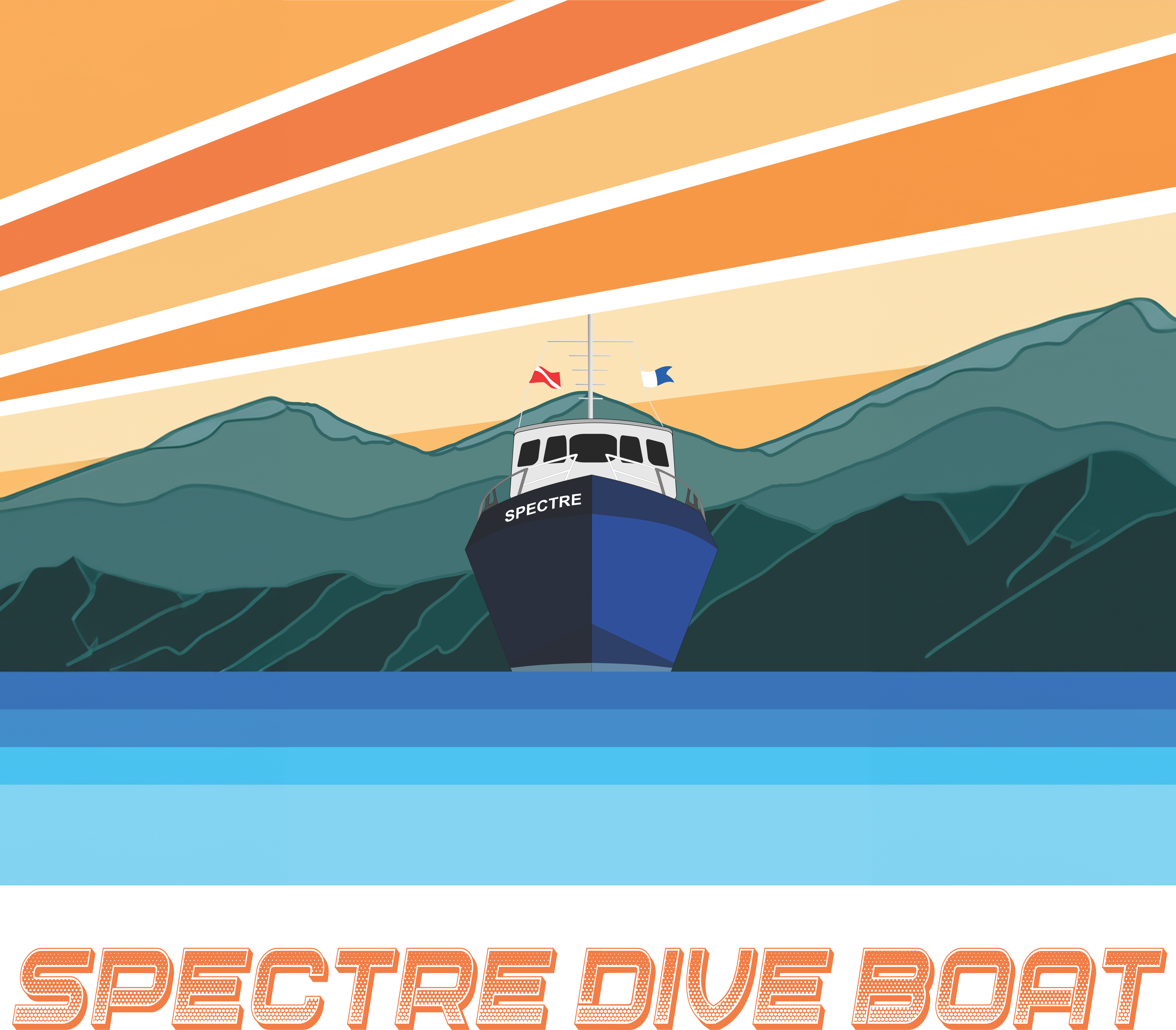
Departing from
Ventura Harbor, CA
Casing
All caps, sentence case, or push to the edge.
Title Case is rare. When in doubt, drop to sentence case or push to ALL CAPS. Avoid the middle.
No emoji
Spectre is an equipment-grade operator brand. No emoji in marketing copy, social captions, or UI.
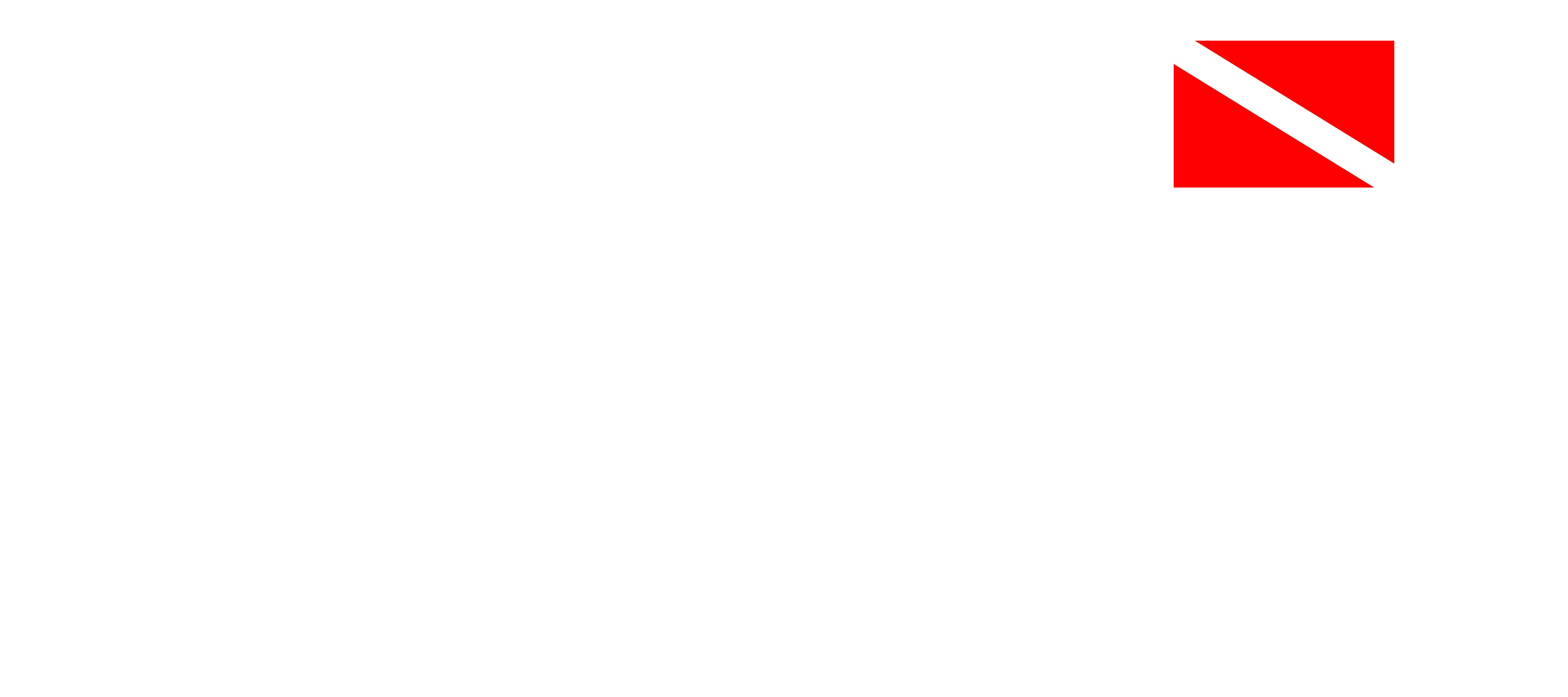 One exception
The diver-down flag — a real graphic, not an OS-rendered character. A symbol of the trade.
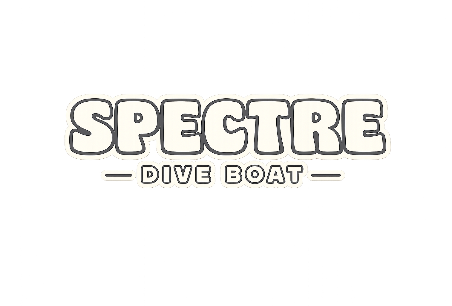
Beyond the wordmark
Three marks. One family.

Original Badge
Heritage circular illustration with the boat at Anacapa Arch. Use on apparel, decals, and editorial covers.

SDB Stamp
"Spectre Dive Boat" circular stamp with bow-on vessel. Merch, decals, secondary marks.
Dive-flag Lockup
Wordmark + diver-down flag. The most recognizable lockup on social, hats, and tees.
Clear space
Give the
mark room
to breathe.
Minimum clear space on every side equals X, the cap-height of the wordmark. Nothing — type, edge, image, or another logo — enters that perimeter.
X
X
X
X
Don't
Six ways to break the wordmark.
If you've ever thought about doing one of these — don't.
Don't stretchDon't rotateDon't recolorLow contrastNo effectsNo busy backgroundsUI icons
Thin stroke. Lucide. 2px.
Icons recede. Photography and typography do the heavy lifting. Monochrome only — black, white, or current text color.
Brand-owned graphic
The dive flag.
Not a generic icon. The diver-down flag is a brand-owned graphic — a real red and white asset, never an OS-rendered character. Always at the official red.
Layout
Full-bleed hero. Flat nav. Sage CTA isolated top-right.
Photography fills the viewport. The wordmark runs full-width centered, tagline beneath it, single sage pill below that. Nav is transparent white — all caps, minimal weight — with BOOK NOW broken out at the far right.
SAMPLE · HOMEPAGE HERO · spectreboat.com
Spectre Boat Gear
Merch
spectreboatgear.com

CLASSIC · ORIGINAL LOGO
FREEDIVER · GRAPHIC
SANTA CRUZ · GRAPHIC
BUBBLE DESIGN · GRAPHIC
Each collection is designed independently, with its own graphic identity and personality. The Classic, Freediver, Santa Cruz and Bubble Design collections give the brand room to speak to different parts of the community without losing what makes Spectre distinct. Where the core brand holds a tight visual standard, the gear collections are where that identity gets to stretch. New collections drop seasonally at spectreboatgear.com.
Applications
Fittings.
HARBOR SIGNAGE
SOCIAL POSTS · 1080 × 1080
BILLBOARD · 16:9
EMAIL · 600 × 600
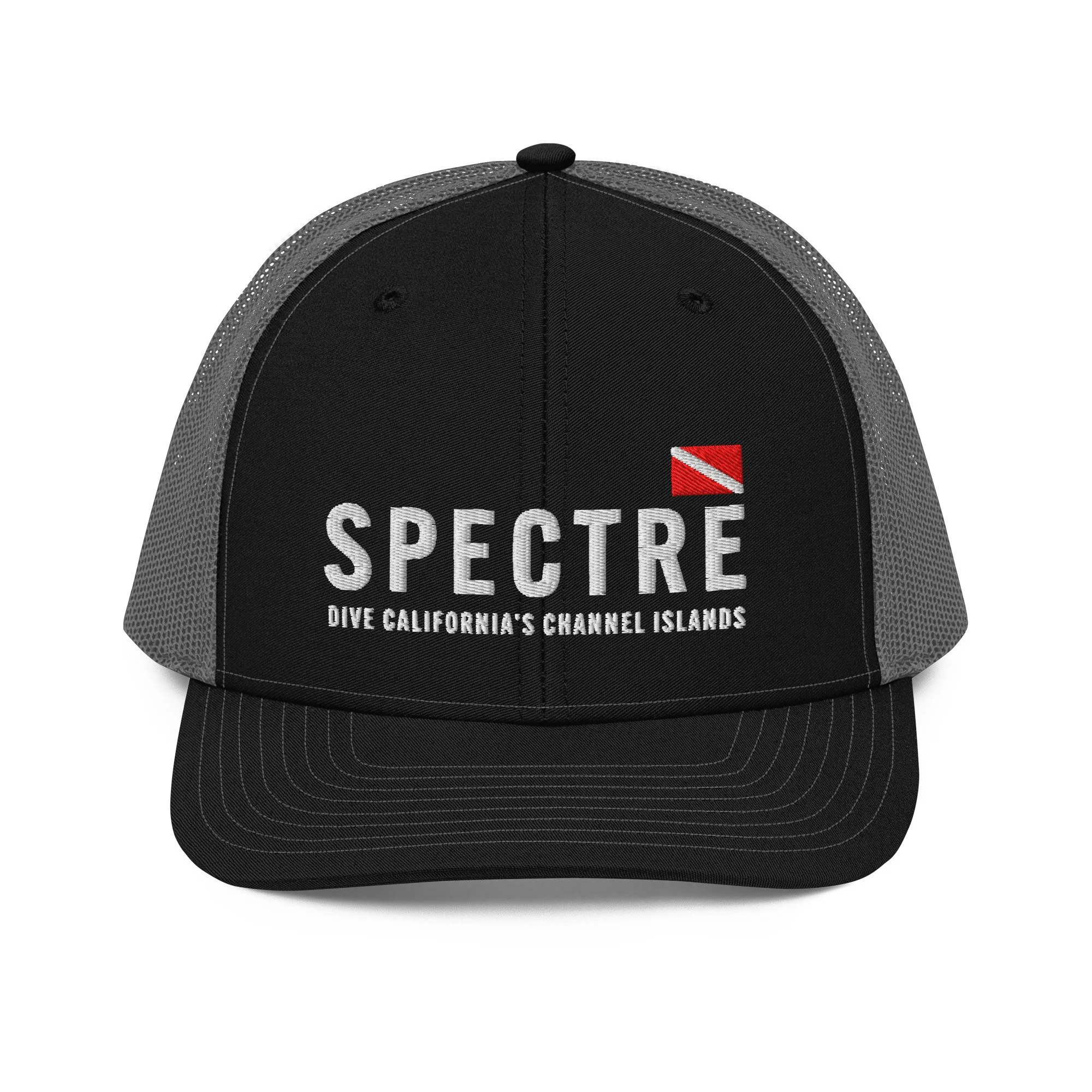

APPAREL
Governance
One studio. Total ownership.
The Design Kollective
One studio behind every creative decision. Design, photography, strategy, marketing and merch all run through The Design Kollective. Nothing gets outsourced, nothing gets lost in translation.
About
The Design
Kollective
A full-service creative studio specializing in brand identity, photography, and digital design. Over 25 years of production and logistics experience inform every project, bringing creative vision and operational precision to the same table.
Storytelling is at the core of the work. From the first brand mark to seasonal collections and campaign photography, every touchpoint is built with intention.
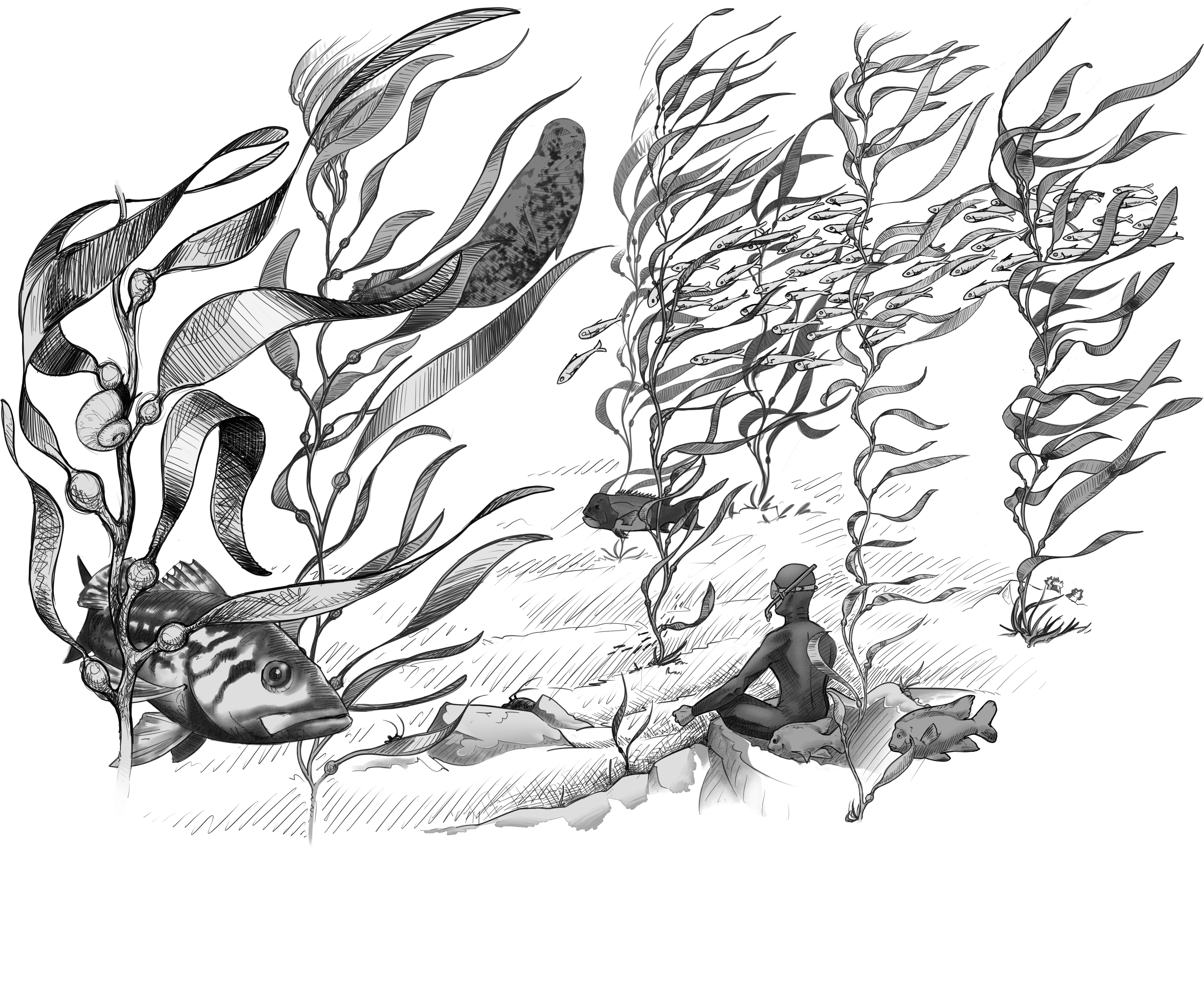
Dive
California's
Channel
Islands.
Book Online Now